Getting proportionality 100% right
Proportionality is core to how we navigate the world.
It’s how we gauge the extent of something.
Is it a big slice or small? Generous or miserly? Almost complete or barely started? Half full or half empty?
We might be ‘middle aged’, ‘middle class’, or just ‘middling’ along.
To know where things stand, we rely on proportionality signals.
So what do you think might be my concern with the new Australian fire danger ratings?
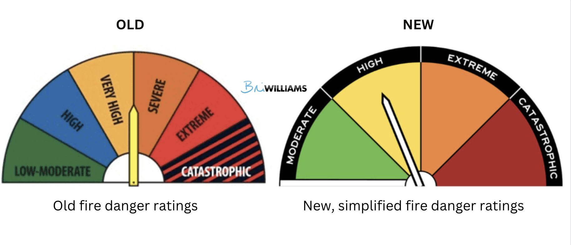
In a positive move, the National Council for Fire and Emergency Services has simplified the Australian Fire Danger Rating System.
Where previously there were six categories of fire danger, this has been whittled down to four: moderate, high, extreme and catastrophic.
The question is, at what point do you want people to take the risk of fire seriously?
This is key to the sign’s behavioural effectiveness.
According to the ratings, the actions recommended at each level of risk are:
- Moderate - Plan and prepare
- High - Be ready to act
- Extreme - Take action now to protect life and property
- Catastrophic For your survival, leave bushfire risk areas
Behavioural responses to three of the four categories are clear.
In Moderate, you can go about your business as usual because there is no imminent risk. For Extreme and Catastrophic, drop everything to focus on your safety.
‘High’ is the murky category.
The authorities want us to be ready to act – to be vigilant. To pay attention to conditions, with one eye on the exit.
But, here’s my concern.
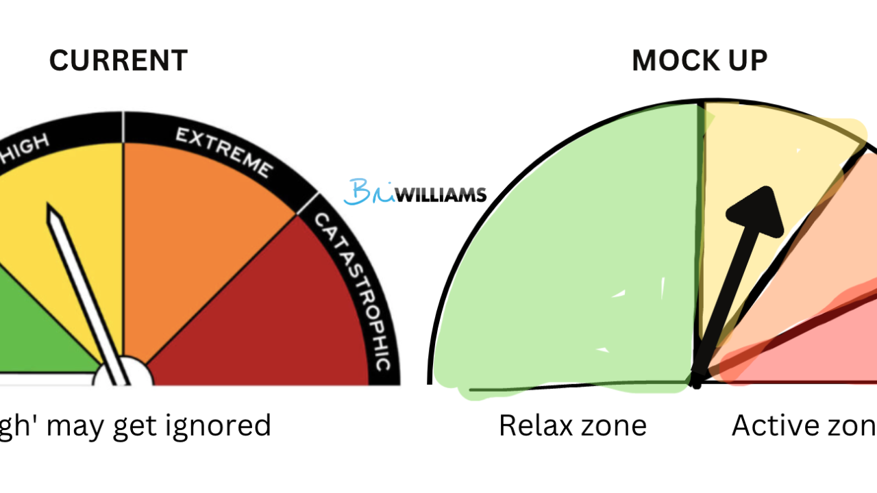
As I drove past one of these signs in regional Victoria on a hot and blustery day, the arrow pointed to 'high', left of half way on the gauge.
My fast processing but superficial System One brain understood that message to be ‘relax, things are fine’.
Were they fine? Well, that depends. There was no fire near me, but it was close to 40 degrees Celsius with a hot northerly wind. In short, maybe I should have been more vigilant than I was.
Imagine if I’d driven past a sign with the same rating categories, but expressed slightly differently. See my mocked up example on the right:
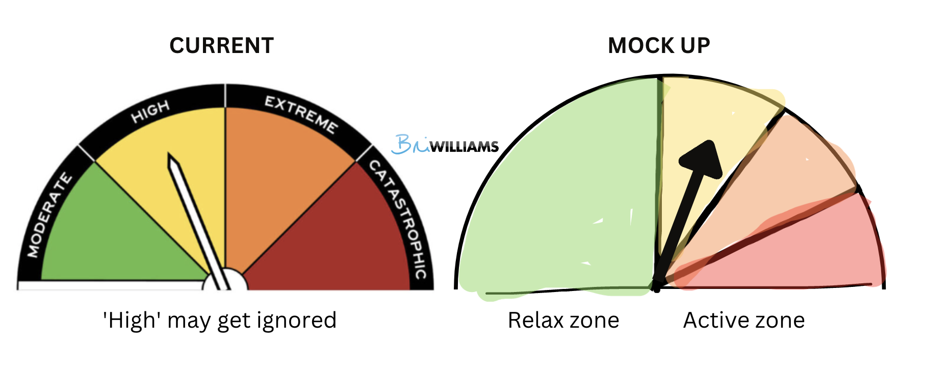
See how, because we are now beyond the halfway point, we’re signalling things are more serious?
High isn’t to be ignored.
This representation of proportionality feels more natural, because most of the time conditions will be normal (i.e., Moderate).
Once the conditions have changed into the danger zone, however, we need to pay attention.
Proportionality was a concept I was reminded of in Sam Tatam’s book Evolutionary Ideas.
He shares the story of his then nearly 3 year old daughter intuiting that a larger plant pot would require more water than a smaller one.
The environment prompted her to ‘magnitude match’ even though she probably didn’t know quite why.
Sam also shares the observation that in the game of craps, people roll the dice gently when looking for a low number, and forcefully when seeking a high score.
This innate sense of magnitude is present, even if it is sometimes more affective than effective.
Throwing dice a particular way might feel right even if it doesn’t actually improve your odds.
And here’s an example of measuring cups from Welcome Industries that use shape to signal whether it is a ¼, ½ or ⅓ of a cup measure.
No need to read the description when the shape helps you understand this at a glance.

But what about business?
Where can we use proportionality to help customers? Here are three examples to get you started.
Signalling progress
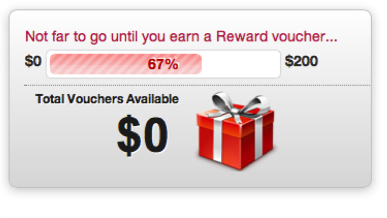
There are times you’ll want to help your customer know how far through a process they are, say with a form to complete or rewards to claim.
The tricky thing is to know whether you should indicate how far they have already come, or how far they have left to go.
Well, according to the ‘Small Area Hypothesis’ (Koo and Fishbach, 2012), people are more motivated towards their goal if their attention is directed to the smaller representation of progress.
That means, if they are closer to the start, emphasise how far they’ve already come.
If they are beyond half way and closer to the end, that’s what you should focus on.
In the example below, that means they should have instead emphasised that there was only 33% remaining to claim their voucher.
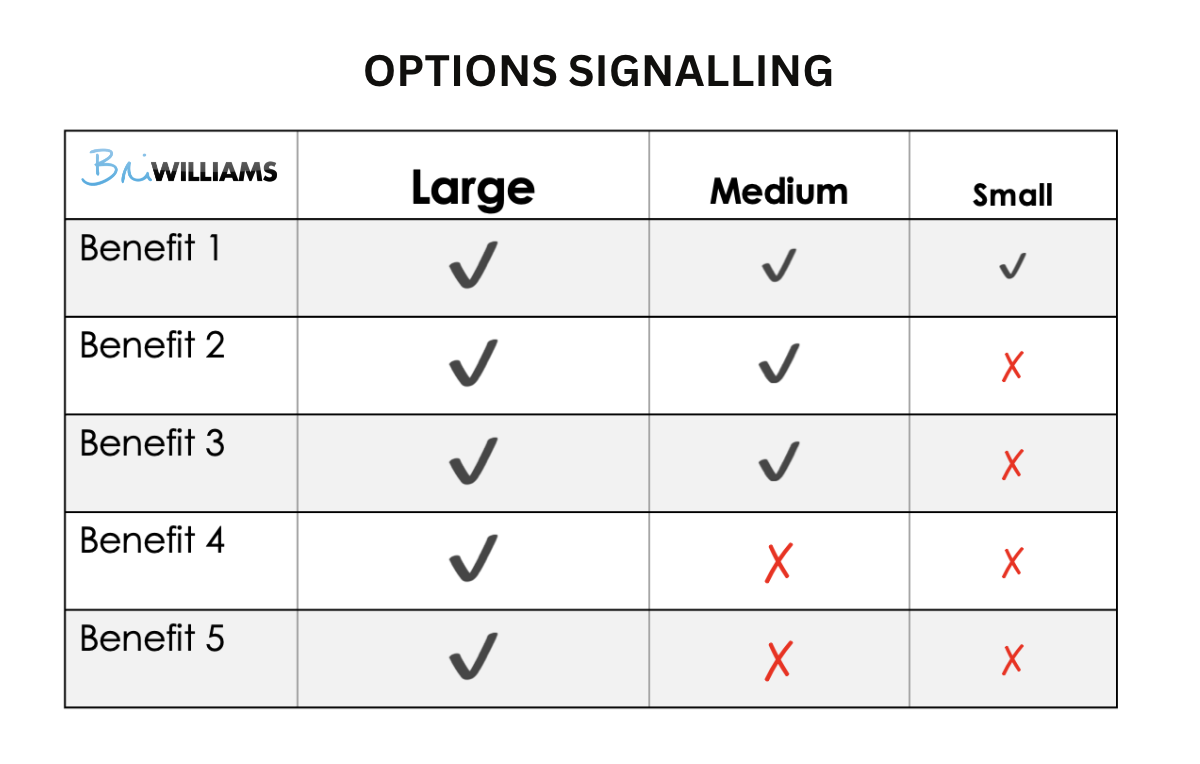
Proposals
When putting forward a table of options to a customer, those options will vary in value and scope.
If you are presenting three options, say small, medium and large, why not represent your columns widths that way? Your largest, most complete or generous package should look the biggest.
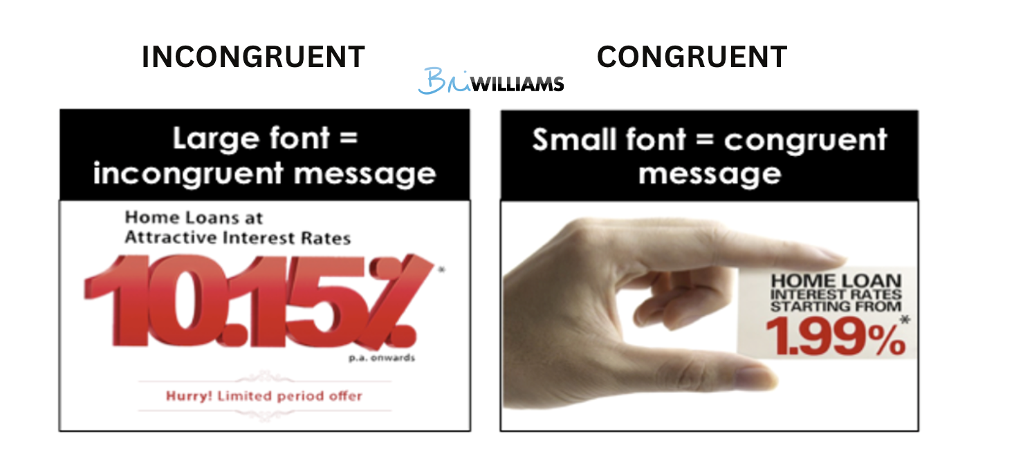
Point of sale
When you want a number to look impressive in your advertising or point of sale, make sure how you present it is congruent with the message you want your customer to take away.
For example, say you are a bank offering a low interest rate on mortgages. Your aim is to make the number look small, like the ad on the right.
Representing the number in big, bold typeface, like the example on the left, is incongruent with the ‘low rate’ message.
Some big lessons from proportionality, I’m sure you’ll agree.
But we’ve only dipped our toe in the ocean of behavioural influence, so if you want me to help your business become behaviourally effective, get in touch.
You might also find interesting:
- The $3,000 coffee (blog) - for more on signs and their impact on behaviour
- Expecting customers to fail (blog) - designing for 'failure states' to support your customer
