How to display product options
Once the dominant streaming service, Netflix is haemorrhaging subscribers, losing market share to the likes of Disney Plus, YouTube and Amazon Prime.
To shore up revenue, they have rolled the dice on a new ad supported "Basic" option.
Is this a good move?
That depends on the behaviour they are seeking to displace. Presumably this is an acquisition rather than retention strategy.
That means they are seeking to win customers from streaming competitors, free-to-air TV or other forms of entertainment, as opposed to salvaging people who may otherwise leave.
If winning new customers is the aim, then upselling them from the entry level product is the game. A lot rides on how they help their customers choose a product.
Here's how they've gone about it:
 Is this the best approach?
Let's look at five design decisions they've made and what we can learn about influencing action.
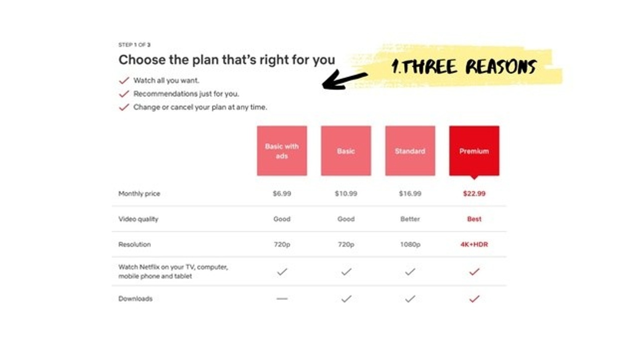
1. Three is key
 The page starts with three benefits of joining Netflix.
Three is the key here, because any more than that would have diluted their impact.
This insight comes to us from research by Carlson & Shu (2013), which found three is the magic number.
Providing more reasons than that triggers skepticism – a case of "doth protest too much".
2. Faux default
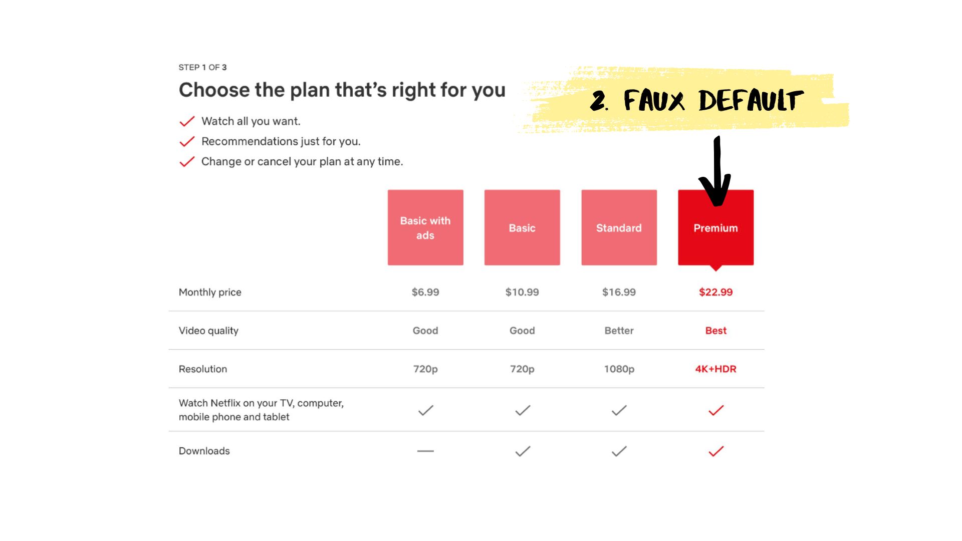
Netflix is using the most vibrant red to draw attention to the Premium product, and including a small arrowhead to infer it is the default option (which I call a 'faux default' because the option isn't actually selected.) These design elements are effective ways to drag people up the value chain, away from the inexpensive options.
3. Product names
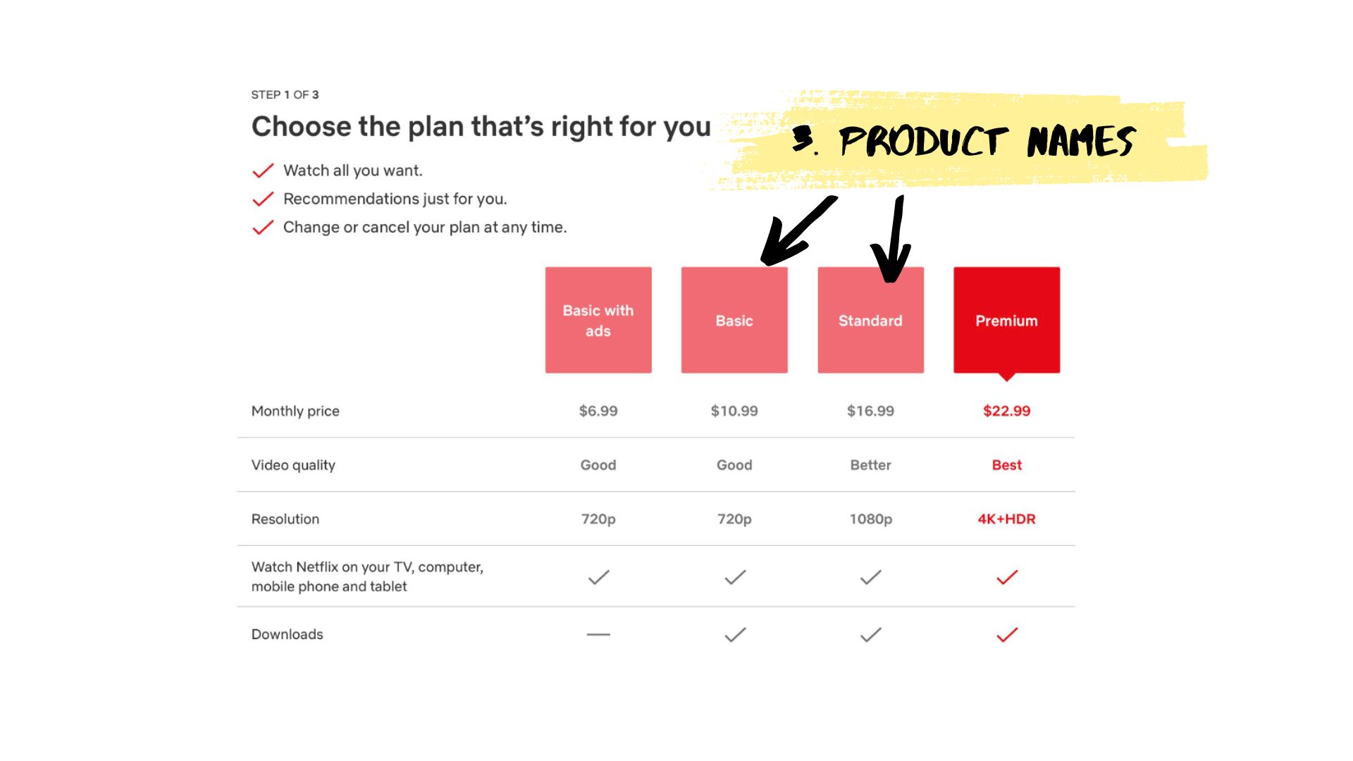
You might have heard me talk about 'standard' being a problematic product name. That's because it makes it sound fine – like the product is the 'standard' choice.
Netflix have cleverly avoided that issue here by calling the least expensive options 'basic'. You want your cheapest option to sound slightly unpalatable!
4. Price sequence
 Netflix are not price anchoring effectively here. By sequencing from least expensive to most, the news just gets worse for people as they move across the page.
As counter intuitive as it may feel, the better approach is to start with your highest price to 'anchor' expectations.
5. Product differentiation
 While the choice of names was good, product differentiation is poor.
While I don't mind the "Good, Good, Better, Best", at glance the tick marks do very little to encourage upsell. There's no clear downside in opting for the Basic package.
When trying to upsell our customers, we need them to feel the pain of choosing the cheapest (or free) option.
What they could have done
There's more we could discuss in relation to this simple table that is expected to do some pretty heavy lifting, but instead here's my quick mock up of what the choice set could look like with a few behavioural tweaks:
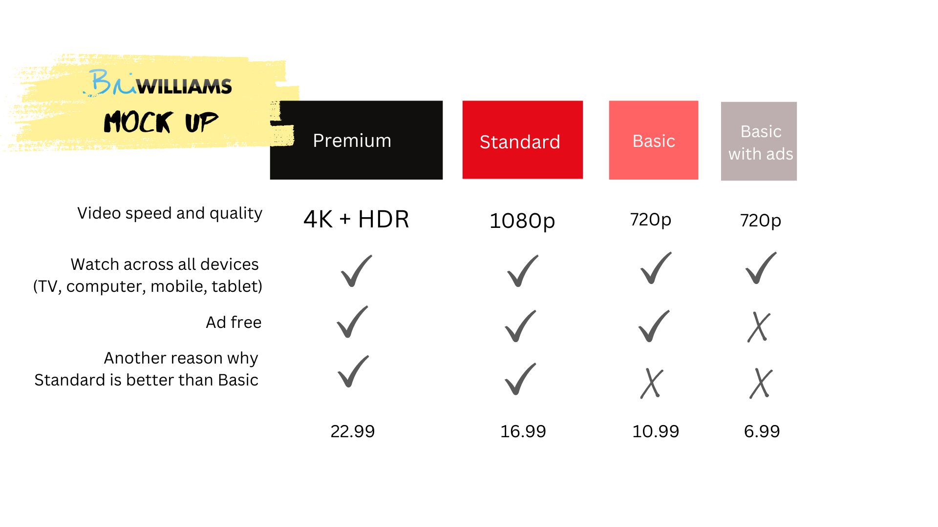 Which techniques have I used here? Let me know what you think you might have spotted. Hint: There are at least five.
Examples like this serve as a reminder that behavioural science can and should be weaved into all points of interaction.
Something as simple as a table of options can be easy to get wrong, but if you know the science, can be easy to get right.
You might also find interesting:
