Every time I load up a post like this, I’m confronted with a scary button.
“Publish.”
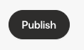
It’s not that publishing is scary, it’s that most of the time, I want to schedule the post for later, not release it right then and there.
The Call-to-Action is misleading.
The first time I clicked it, my heart was in my mouth. Would the post go live immediately? Would I be scrambling to delete it? Much to my relief, the scheduling option was on the next page.
👉 Here’s the issue, though: That unnecessary moment of panic. That tiny spike of button anxiety. That unwanted psychological friction.
And it’s so easily avoided. Rename the button “Schedule post.”
But this isn’t really about a button, it’s about design choices. Every interaction is either building trust or eroding it.
- The wrong word, the wrong label, the wrong micro-decision can create doubt where confidence should be.
- When people know what to expect, they move forward without hesitation. When they don’t, they hesitate, second-guess, or disengage.
👉👉 Because customer experience lives in micro moments – the tiny labels, instructions, and prompts that guide people along. They’re invisible when they work well, but glaringly obvious when they don’t.
❓Where might your customers be feeling that same little spike of button anxiety? What’s the simple change that could turn it into a moment of clarity instead?
![]()
🌟 If you found this interesting, let me know! Buy me a virtual coffee ☕ or forward this email ↗️ to someone who also might like it. Your occasional support means I can keep sharing ideas about behavioural science for free.
🧠 Learn the science of Influencing Action
📈 Be shown exactly what to do to get better results for your small business
Hey, are we connected yet?
![]()
![]()
![]()
